Google Just Severed a Massive Botnet Infecting 1.3 Million Smart TVs
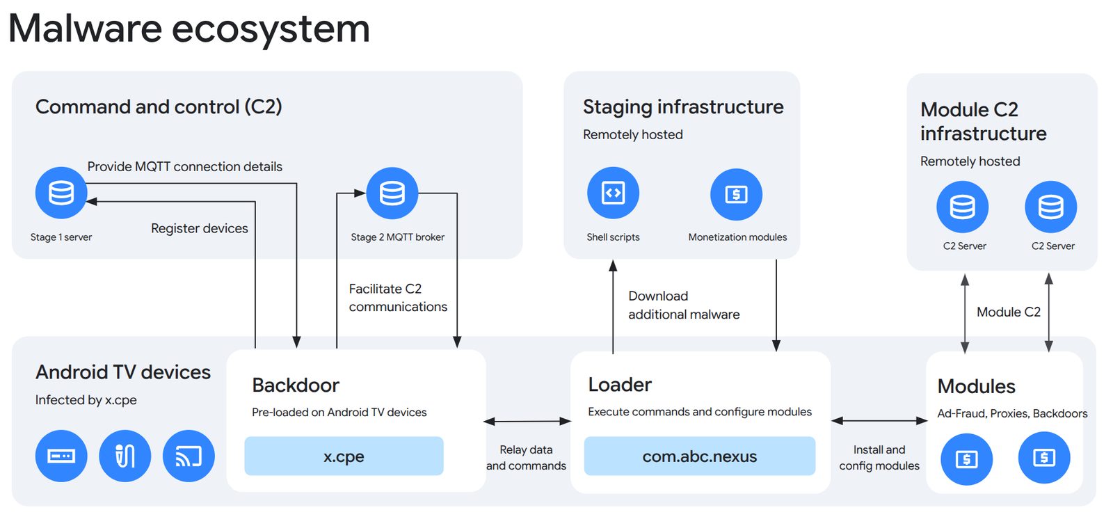
Google and its industry partners have just exposed a hardware manufacturer that pre-installed malicious backdoors on over a million Android TVs.
Google has officially begun rolling out a fresh visual update for three of its most fundamental communication apps on Android i.e. Google Messages, Phone by Google, and Google Contacts.
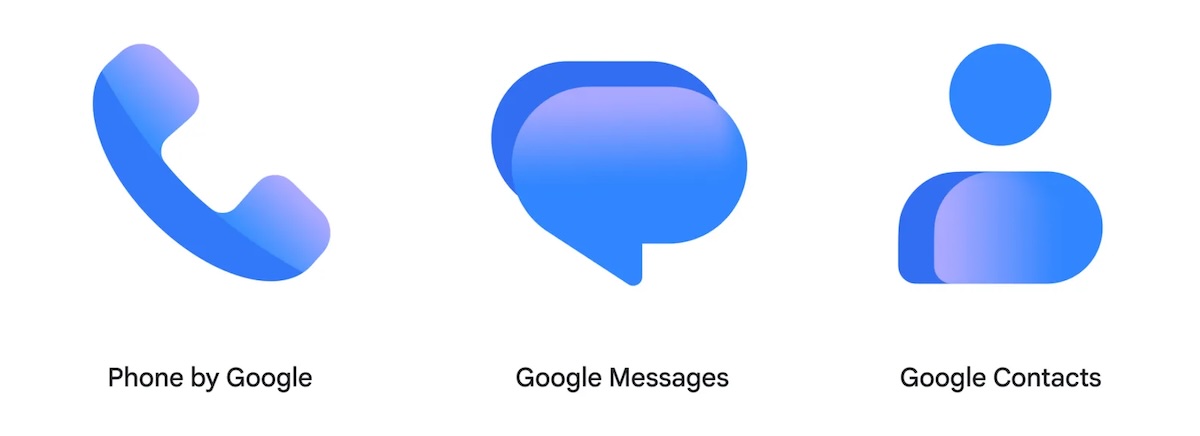
While the core functionality of these utilities remains untouched, the visual overhaul aims to bring a tighter, more cohesive family aesthetic to your daily device usage. According to the Google, the redesign directly responds to user feedback by fine-tuning app aesthetics for modern high-density screens.
At first glance, the changes introduce a cleaner layout defined by a few distinct aesthetic tweaks:
The new icons are currently making their way to users worldwide, though it may take a few weeks for the update to hit every eligible device and reach full availability.
Beta testers and Pixel owners often see these server-side shifts and application updates land first, but general users can expect the refreshed look to appear automatically on their app drawers and home screens soon.
Want to see more of our stories on Google?
P.S. Want to keep this site truly independent? Support us by buying us a beer, treating us to a coffee, or shopping through Amazon here. Links in this post are affiliate links, so we earn a tiny commission at no charge to you. Thanks for supporting independent Canadian media!